I’m in night mode right now, which is probably a good thing, since the Calgary Stampede has started up, and the drunken revelry down the hill from me doesn’t even begin to quiet down until 3 a.m. Fortunately I like working at night, and I’ve got a fair amount done this weekend: a CreateSpace template, an ebook template, and a lot of boning up on the art and science of book design. I give the details of my process here, in case anyone is interested.
1. Designing a print template
Friday night, I followed up on this link, which I got courtesy of Sarah Dimento:
There’s a lot of boring-fascinating stuff about the layout of mediaeval manuscripts and the use of the Golden Ratio, and the work of (chiefly) Jan Tschichold in reconstructing the principles of design used in the days of the monastic scriptorium. Some of the details are inapplicable to modern design; others have gone by the wayside because it was too expensive to follow them.
I have long had a hankering to apply my ancient desktop publishing skills to book design; CreateSpace gives me a reason to do it. So after reading up on the canons, I spent the rest of Friday night working up a template for trade paperbacks in a stock 51⁄2″ by 81⁄2″ trim size. This, by the way, is a truly wretched ratio; its only advantage is that it is exactly half the size of U.S. letter paper. The mediaevals, when they could not work with the Golden Ratio, liked simple integer ratios — 3 : 2 or 4 : 3; the traditional octavo was most often six inches by nine. One still sees that size a good deal for larger books, but it is still fairly uncommon in paperback. The more common size has a ratio of 17 : 11, which is utterly cockeyed. But art, as somebody or other said, is the victory of skill over material; or in this case, the victory of one person’s cussed determination to make things attractive over some thoughtless goof’s cussed determination to standardize on ugly.
One of the canons specifies that the page should be divided up into a 9 × 9 grid. The standard margin is one row at the top, two rows at the bottom, one column on the inside (binding) edge, and two columns at the outside edge. If the paper is 6″ x 9″, or any other size with a nice 2 : 3 ratio, then the ‘live’ or printed area of the page will be exactly as tall as the page is wide. This is supposed to be visually pleasing and harmonious, but to the modern eye it looks rather odd. The idea was that the bottom margin should be bigger than the top: first, because it made the text look high and buoyant (and rising towards heaven) on the page; second, because people were supposed to grip the book by the bottom edge, and a nice wide margin meant they would not get their grubby fingers on the lettering.
Now, 11 : 17, as I said, is a nasty ratio. But 51⁄4″ × 81⁄2″ is a 21 : 34 ratio. It happens that 21 and 34 are both Fibonacci numbers; and this is important. You will recall that the Fibonacci series begins: 1, 1, 2, 3, 5, 8, 13, 21, 34 — each number equals the sum of the previous two. The further you go in the series, the closer the ratio between two consecutive numbers approaches to the so-called Golden Ratio. The ratio of 21 : 34 is very close indeed — the error is less than one part per thousand. So I simply treated the quarter-inch of paper nearest the binding as a useless gutter, ignored it, and divided up the rest of the page into a 9 × 9 grid. The whole page (minus gutter) is now proportioned in the Golden Ratio, and so is each section of the grid.
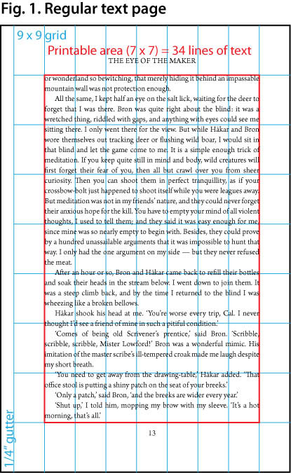
Modern eyes find it strange to have a two-inch margin at the bottom of a nine-inch page; and modern purses rebel against paying for unnecessary pages. By making the printed area 7 × 7 grid sections, I could leave an adequate margin on all sides — 17⁄18″ (68 points) at the top and bottom, 11⁄18″ (44 points) on the left and right, plus the 1⁄4″ gutter on the inside edge. The remaining ‘live’ area has the same 21 : 34 ratio as the grid sections it is built from. And now the magic of Signor Fibonacci really goes to work.
By a wonderful dispensation, 7⁄9 of an 81⁄2″ page is exactly 476 points; and 476 equals 34 × 14. Now, 14-point leading is just about perfect for 12-point type, and quite acceptable for 11-point type. So if I set my leading for body text to 14 points, I could fit 34 lines on a page; and 34 is a Fibonacci number. This gives rise to all kinds of harmonious and interesting possibilities.
I could have thrown the Golden Ratio to the winds and got a few more lines on the page, but there is really no need for it. Paperback design used to be a matter of producing books as cheaply as possible, which meant narrow margins, small type, and close leading. Now the ebook has taken over as the cheap edition, and even a trade paperback can afford to be an objet d’art. I stuck with the 34-line layout; and if that requires me to stick an extra dollar or two onto the price of a book, so be it. If people don’t like it, let them eat Kindle or Kobo. I could choose not to put out printed editions at all. It’s not as if I expect them to be big sellers.
So we have 34 lines of text in the central area of our 9 × 9 grid. (See Fig. 1 below.) We could divide the live area into a grid of 21 × 34 perfect squares. I have not illustrated this, but it is worth bearing in mind. For the thing about the Golden Ratio, the thing that attracted the ancient Greeks to it, is that if you take a rectangle in that ratio, and cut a square off one end, the bit that is left will also be a rectangle in the Golden Ratio. If we take our 21 × 34 Fibonacci rectangle, and cut off a 21 × 21 square from the bottom, we will be left with an area of 21 × 13 — another Fibonacci rectangle.
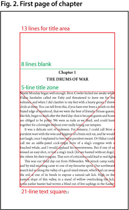
Accordingly, I drew a rule across the page 13 lines down. The printed area below that rule contains 21 lines and is exactly square. That is where I chose to begin the text on the first page of a chapter. There remain 13 lines above the rule. The next two smaller Fibonacci numbers are 5 and 8, so I left 8 blank lines at the top of the page and allocated the remaining 5 lines for the chapter title. The next two numbers are 3 and 2, so I used 3 lines for the title itself and 2 for white space between the title and the square block of text. Since I want to make the chapter titles bigger than the text without disturbing the grid, I set the leading on those lines equal to 11⁄2 spacing — 21 points. That means 2 lines of the larger type take up 3 lines of the regular grid, which is exactly what I have available. One line for the chapter number, one for the title: presto! If there is no chapter number (for the Introduction or Prologue, or About the Author, or suchlike bumph) I simply leave the first line blank; then the title is centred in the 5-line zone. (See Fig. 2.)
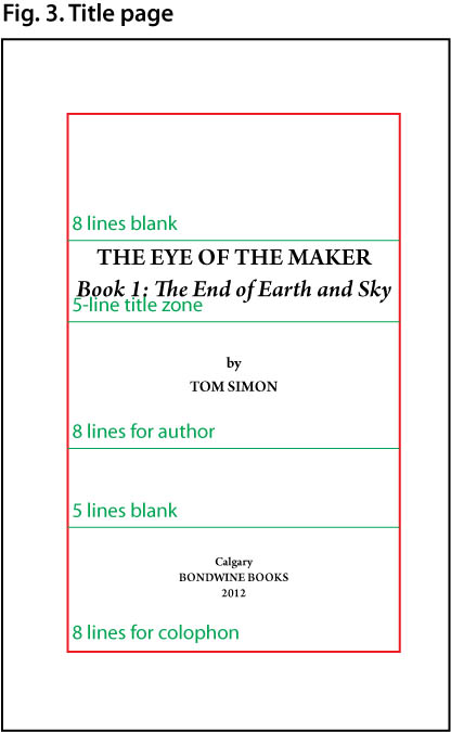
Again, for the title page, I used still larger type — exactly twice the size of the regular text, 22 points with 28-point leading. The title (2 lines) then takes up the top 4 lines of the 5-line zone. The 21-line square, which was all text on the first page of a chapter, can be broken up into 8 + 13, or 8 + 5 + 8. So I put the author’s name square in the centre of the next 8-line block, left the following 5 lines blank, and gave over the bottom 8 lines to my (text-only) colophon. The 34 lines of the title page are thus divided in a regular pattern, 8–5–8–5–8. (See Fig. 3.)
The running head goes in the top margin, the page number in the bottom. Again I use the Golden Ratio to advantage. Both these margins are one 9 × 9 grid unit (68 points) high; and 68 = 2 × 34 — that is, exactly double a Fibonacci number. So I leave 42 points (2 × 21) of white space at the edge of the page, and put the header and footer just inside the remaining 26 points (2 × 13).
For this purpose, I set up three master spreads in InDesign. One contains no header or footer at all, only the master text area; I use that for things like the title page, or for blank pages. The second contains a footer only, and is used for the first page of a chapter (where I don’t want the running head breaking up the white space at the top). The third contains both the header and footer. If you look closely, you will see these masters applied to Fig. 3, Fig. 2, and Fig. 1, respectively.
Result: a harmonious grid-based layout in which all the proportions are carefully designed to please the eye, even though the size of the paper isn’t. For the finishing touch, I set the paragraph indent equal to the leading. So if the live area is divided into a grid of 21 × 34 squares, the indent at the start of each paragraph forms a perfect square 1 grid unit on a side. So we can find the first nine Fibonacci numbers used in the template.
It remained to actually fill up the live areas of the pages with text. It is my firm belief, and has been for years, that Robert Slimbach (of Adobe) is the greatest living typeface designer, and one of the best of all time. I chose his Arno Pro design for my template. Arno is a very elegant old-style face in the Venetian tradition, with a huge variety of weights and optical sizes. It includes not only the Roman alphabet (with diacritic marks for every European language) but Greek and Cyrillic as well; which I may find handy in the future, for I occasionally quote bits of Greek, and want to be able to print them in the original alphabet instead of the (unreliable) romanized version. Arno is also one of the few typefaces to include the Middle English letter yogh (that’s ȝ, if your browser can display it).
The sample text in the three figures above is done in Arno, though it is probably too small for you to read. Best of all, from my point of view, Arno was included as a freebie in Adobe Creative Suite 3, which I bought a few years ago when I was a student at the University of Calgary. So it wasn’t exactly free, but it costs me nothing now, when I am working under the tightest budget imaginable.
2. Preparing a .DOC file for Smashwords
Last night’s work was less fun, but will almost certainly be better-paying in the long run. That was the touchy job of converting a book manuscript from the ugly mishmash that is a typical Microsoft Word .doc file into the simplified and streamlined kind of .doc that Smashwords wants for its Meatgrinder conversion program. (As I think I have said before, Mark Coker has the worst taste in names. Smash words! Grind meat! I think his corporate branding consultant must be Animal from the Muppet Show.)

Hehh, hehh, hehh!
Now that I have beguiled you with Muppets, let us carry on, refreshed, for the rest of the story.
Smashwords wants you to use styles for all your formatting (beyond very basic things like boldface and italics), and particularly for things like indents and paragraph spacing. This I was doing already. But it also wants you to use the ‘Normal’ style as the basis for all the others; and I was not doing that. In fact, my Word style sheets were such a mess, built up over decades of use and through many different versions of MS Office — I used Word 1.0 on my original Mac in 1984 — that I could hardly rely on them to perform as expected myself.
So I followed the rules in the Smashwords Style Guide for what Mr. Coker, with his usual subtlety, calls the Nuclear Option. This is to utterly abolish all formatting by saving the manuscript as plain text, and then go back and put in such styles (based on Normal) as will convey the bare minimum information needful for an ebook. The idea is to make it comprehensible, and let the reader’s software make it pretty — or not. A Smashwords-formatted ebook really is the modern answer to the early mass-market paperback of fifty or sixty years ago: cheap, disposable, aesthetically null, and invariably typeset in Times Roman.
I have a tip to pass on, which my 3.6 Loyal Readers may one day find useful. Things like chapter titles, poems, and long quotations are easy to spot in a manuscript, and easy enough to put back by hand after the formatting has been nuked. Italics, however, are a real bear. They can occur anywhere, and may be only one word long, or even a single character; and they can be the devil to spot. The hard way to do this is to have the manuscript in hand (or in a second window beside the nuked text) and read, slowly, painstakingly, line by line and word by word, and spot just those bits that are italicized, and then find the corresponding bits in the nuked format and reapply italics to them.
Fortunately there is an easy way. You can use the search and replace function in Word to detect (and change) formatting as well as particular bits of text. (Codejacked.com has a handy article explaining the technique.) Combine this with the wildcard feature, and you have my method:
1. If you are using a recent version of Word, make sure to use ‘Advanced Find & Replace’ instead of the search box in the toolbar. The toolbar can’t handle things like formatting. In older versions, there is only one ‘Find & Replace’ menu item, which opens the dialogue box that you need.
2. Make sure that the ‘Use Wildcards’ checkbox is checked.
3. Click in the ‘Find What’ box and type a question mark: ? . This will search for any character.
4. Without clicking in any other text box, click on the ‘Format’ pull-down menu at the bottom of the dialogue box. Select ‘Font’ and choose ‘Italics’. Underneath the ‘Find What’ box, it should now say ‘Format: Font: Italic’.
5. Click in the ‘Replace With’ box and type a vertical bar, caret, and ampersand: |^& . This will replace the found character with the bar | , followed by the original character.
6. Click ‘Replace All’.
When the search finishes running, you will find that every italicized character in your entire manuscript is preceded by a vertical bar, |l|i|k|e |t|h|i|s. I chose the vertical bar because that character does not naturally occur in any of my stories. If you use that symbol in your manuscripts, pick a symbol that you don’t use. But be careful: several of the symbols on your keyboard are reserved for special functions in the Word search box. For instance, you can’t use the backslash \ , because that is reserved for certain kinds of numeric expressions.
7. Now go ahead and ‘Save As’, and select ‘Plain text (.txt)’ from the ‘Format’ pull-down menu. Close your manuscript file and open the plain text file you just created.
8. ‘Select All’ and apply the Normal paragraph style to your entire document. (This is part of the standard instructions for the Nuclear Option.)
9. Go back to the Find & Replace dialogue box. In ‘Find What’, type the vertical bar and a question mark: |?
10. In ‘Replace With’, type a caret and ampersand: ^& . As before, this will replace the found text with itself; only this time, you do not want to add anything.
11. Without clicking in any other text box, click on the ‘Format’ pull-down menu, select ‘Font’, and choose ‘Italics’, as before. You should now see ‘Format: Font: Italic’ under the ‘Replace With’ field.
12. Click ‘Replace All’.
Now every character preceded by | is italicized again. All you need to do now is remove the scaffolding, so to speak, by getting rid of the vertical bars.
13. Change the text in the ‘Find What’ field to the vertical bar | .
14. Delete everything from the ‘Replace With’ field. Again, without clicking in any other text box, click on the ‘No formatting’ button. ‘Format: Font: Italic’ should disappear from under the ‘Replace With’ field.
15. Click ‘Replace All’.
This will replace all the vertical bars with nothing. Presto! Your temporary markers are gone, and every character that was italicized in the old version is now italicized in the new.
This sounds like a complicated procedure, and in fact it took me a bit of work to figure out how to do it. But it is nothing compared to the drudgery of finding scores or hundreds of italicized passages in a book-length manuscript, hand-correcting them all, and not making any errors.
Once you have done this, you will want to apply other styles to your nuked text. I made up style sheets for ‘Chapter title’, ‘Centred’, ‘Blockquote’ (indented 1⁄6″ from both margins), ‘Verses’ (Blockquote with a hanging paragraph indent, in case a line of verse wraps on a small screen), and some others — nine in all. One that I don’t strictly need but like to have available is ‘No indent’, which is just what it says on the tin; it also adds 12 points of space before the paragraph. I use it for the first paragraph of a chapter, or the paragraph after a scene break.
I took the trouble of adding the new styles (and the modified Normal) to Normal.dotm using the Style Organizer, so they will be available to me in every new document. (I also deleted some old styles that I haven’t used for years.) In the future, I should be able to write ab initio in ‘nuked’ format, and then export the formatted text into my InDesign template for the paper editions. I still have to go through the whole Nuclear Option with several other manuscripts — I haven’t yet done the Filthy Screed or the Scratch Monkey, to say nothing of unfinished projects — but once that is done, I should have a simplified and streamlined workflow that will allow me to produce both ebooks and paper books with a minimum of bother. Based on what I have done so far, I should be able to prepare a complete novel manuscript for both formats in two or three hours.
Now all I need is a tall building to leap over. I probably can’t do it at a single bound, but I’m sure I could write a macro.



Speak Your Mind