Good news, everybody!
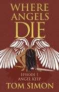
The formidable and talented Sarah Dimento has delivered the all-but-final cover design for Where Angels Die, based on my rough concept and rubbishy layout.
I always feel embarrassed when taking cover ideas to Sarah, because something about her puts me in mind of Edna Mode from The Incredibles: ‘This is a hobo suit, dahling, you can’t be seen in this, I won’t allow it!’ But she has a rather nifty way of turning those hobo suits into eye-catching book covers.
The current idea is to release each episode of Angels under separate cover, and then bundle them as a fix-up novel later. To minimize the amount of design work required, we have it in mind to reuse the same design with different background colours (and, of course, episode titles). The design follows the jump below.
What do you all think?


I like it! And I’m definitely looking forward to getting to read this once it’s finished. 😀
That’s very eye catching and appealing.
I’m going to make one caveat: the angel itself needs to be cleaned up a bit. If this is just a draft copy, then I’m sure the minor draftsmanship details will be “fixed in post” But just in case:
..the hand position on the sword hilt needs to have the hand bent at the wrist by about 30 degrees clockwise
–However, the position of the sword makes the hilt’s crosspiece look as if it’s also the angel’s knee. Quick fix: tweak the hair. If you have the hand gripping the hilt properly the crosspiece won’t need to be seen.
HTH
I’m glad you like the general design. Thanks for your comment.
The thing about the hand position: The angel isn’t gripping the sword at all, and is probably incapable of doing so – being near death and all that.
As for the crosspiece, both Sarah and I are a bit puzzled. I’m not sure how a yellow (gold) crosspiece can look like a brown knee. Possibly you could explain better what it is that you’re seeing there?
Tweaking the hair, alas, isn’t really an option; we used vector art for the angel, and Sarah’s fee will at least triple if she has to get in and edit the vectors in that degree of detail. (We agreed at the outset that we would use vector art whenever possible, for the cleanest possible reproduction at all sizes from thumbnail to printed paperback.)
Tiny quibble: the sword is at about 10 degrees to the horizontal; the crosspiece looks vertical to me. Therefore, the angle between the sword and the crosspiece, which should be 90 degrees, isn’t. Just math.
Goodcatch. A minor alteration would definitely do some good there.
I was just looking carefully at the actual vector illustration. At full resolution, it’s possible to tell that the crosspiece is curved, and the (hidden) intersection with the blade, if you extrapolate the curve, is at right angles. But at the resolution reproduced here, that detail gets lost and the eye is fooled into thinking that it’s a straight crosspiece drawn crooked.
I shall ask Sarah about it when next I see her, to see if there’s an easy fix.
For what it is worth, I didn’t see a problem with the illustration; it may be my mind filling in for me (I think that the slightly curved crosspiece is a good look for swords), but the illustration is sound from my perspective.
Thanks! (Sarah has flatly refused to do any more fiddling unless I pay her extra.)
Sorry to take so long to reply to this. I’ve been swamped with drawing and Summer Reading program. It’s easier to show what I mean than to explain (clearly).
First off: it’s a minor quibble: if it’s not an easy or simple fix, please ignore! The overall effect is VERY strong: clean, vivid and appealing.
That said, sorry about the knee comment: you’re right, it’s obvious it’s not the angel’s knee, but it did seem slightly “off” once I started looking closely. It’s mainly the hand on the hilt (and I drew two sketches on top of the design, with the hair cleared away to show what I meant – let me know if you want to see them) before I got back to see that any fiddles would be expensive! So right out.
Again, this is the kind of thing that one spots if one is actively looking for things to tweak. If not, no worries, and I look forward to adding the title to my book shelves.
No worries indeed. I did ask for feedback.
The current plan is that this will be a temporary ebook cover (reused for each episode with a different subtitle and background colour), and then I’ll hire Sarah to do a new cover for the eventual fixup novel.