An interesting day today.
Our Esteemed Cover Artist, Sarah Dimento, delivered the cover design for my forthcoming story collection, The Worm of the Ages and Other Tails. (Current plan is to release Style is the Rocket in May and Worm in June. I have another short book that may be ready to go in July, if my health holds up.)
Here is a closer look at the cover:
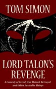
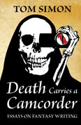
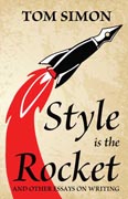
Sarah and I are trying to develop what the jargonists call a ‘design language’ (pretentious term!) for the covers. Some general rules:
- Consistent typographical design. (We’re using the Brioso type family from Adobe, designed by the incomparable Robert Slimbach.)
- Vector art instead of photographs or pixel-mapped art, to allow higher quality in print reproduction (and sharper rendering at all sizes).
- Clear, iconic visual elements that plainly signal the genre and tone of the work at thumbnail size.
- Consistent colour schemes and backgrounds. We have settled on using a parchment background for the essay collections, and solid colours (with a sort of leathery craquelure texture) for fiction.
A further note on #3: Many self-published authors try to imitate the styles of the big publishing houses, and try to illustrate a scene or motif from the book with digitally edited photographs (or even an original drawing or painting). This, in our opinion, is a mistake. Such designs can look good at the size of a printed book, but even there, they tend to blur together on a display shelf; the reader is left relying upon the printed title and author name to distinguish one design from another. (Some designs, indeed, have been used and reused for dozens of books by different authors, with only superficial changes.)
While it is true that an ebook cover is an important marketing tool, most people will see it at thumbnail size; and whatever graphic elements are included have got to be clearly distinguishable at that size. We believe that in the environment of an Amazon page (or other ebook seller’s site), a cover design will work better by functioning like the icon for an app, rather than an imitation of a dust jacket.
The design above, I think, fulfils this purpose reasonably well. Everything is quite clear at thumbnail size (except the explanatory legend ‘Six Short Fantasies’ at the bottom); but if you zoom in and view the full-size artwork, you see finer details – the embossing effect on the text and graphics, the texture of the background – which reward the eye for its curiosity. As for the graphic, nothing says fantasy like a heraldic-looking dragon.
In other news, today I was driving about on errands and listening to the Fan 960, our local sports radio station – thereby performing my patriotic duty as a Canadian hockey fan. I heard that the afternoon crew were doing a live remote broadcast from the newest location of a Canadian fast food chain called South St. Burger. The place was quite near me as I was driving; I thought, ‘How interesting. Must try it sometime.’ Then they announced that for every burger sold today, the restaurant would make a donation to the Red Cross for their relief work in Fort McMurray, Alberta.
You may have heard about the Fort McMurray fire. For some days now, thanks to hot weather in that part of northern Alberta, the city has been nearly surrounded by forest fires. The whole population of 80,000 has been evacuated, except for firefighters and emergency crews, and sizable parts of the city have already burnt down. Urgent pleas for aid are flying out in all directions. I am far from being a rich man, but I thought the least I could do was to help the South Street (South Saint?) people with their fundraising effort.
So I turned the car around, drove to South St. Burger, and had a mushroom Swiss burger combo (quite tasty) whilst rubbernecking at the radio crew. The announcer, Rob Kerr, came over during a commercial break to introduce himself and shake hands. As I was finishing my meal, the broadcast ended, and the technician began taking down the equipment (a much smaller job than it used to be). I wandered over and struck up a conversation with Mr. Kerr, and we talked for about ten minutes.
The talk of the hockey world at the moment is that the Arizona Coyotes have hired a 26-year-old statistical analyst as their new general manager. ‘Advanced’ statistics (think Moneyball, if that helps) have a bit of a bad reputation in hockey, because of the exaggerated claims made by some advocates for what are really very simple and inaccurate attempts to measure some of the variables in a complex and fast-moving game. John Chayka, the new Arizona GM, is not part of that picture. He founded a firm to design sophisticated and proprietary stats software for National Hockey League teams. Every second of play, every frame of video, is broken down in detail, and all the information gathered in an enormous database from which all kinds of interesting statistical inferences can be mined. Alas, the general public (including amateur ‘advanced stats’ people) have no access to these systems.
I mentioned to Mr. Kerr that I would like to hear more about these genuinely advanced statistics and their effect on the game. He agreed with me, but pointed out that some of his listeners don’t want to hear it. Neither do a lot of senior executives in the hockey business. Many of the older generation of managers still take the attitude that John Henry (as played by Arliss Howard) described at the end of the Moneyball film:
The first guy through the wall, he always gets bloody. Always. This is threatening not just a way of doing business, but in their minds, it’s threatening the game. But really what it’s threatening is their livelihood, it’s threatening their jobs, it’s threatening the way that they do things. And every time that happens, whether it’s a government, or a way of doing business, or whatever it is, the people who are holding the reins, have their hands on the switch, they go batshit crazy.
Rob Kerr operates at the tectonic fault between two industries being disrupted by new technology: media and professional sports. He mentioned how technology has literally made it possible for him to broadcast his radio show from his mobile phone; he did it just the other day. A fire alarm forced him to evacuate a remote location, and he finished his broadcast over the phone, sitting under a tree. The effect of ‘big data’ and advanced statistics on the sports business, of course, is just as John Henry described, and it is just now beginning to have large effects on hockey. As for me, I work in a field that is being completely remade by ebooks, print-on-demand machines, and the miraculous selling machine called Amazon. Bondwine Books is a creature of the present decade; I could not have been in this business just a few years ago.
So we sat and compared notes on the disruptions. I pointed out that New York publishing is still largely run by people who went to Ivy League schools, and were rich enough that Mummy and Daddy could pay their rent in Manhattan whilst they worked at unpaid internships for publishing houses. They know less than nothing about the kind of people who buy their products; and it shows in their foolish business practices and appalling decisions. Mr. Kerr countered that the sports business is largely run by retired professional athletes, who are almost equally unable to relate to the concerns of their customers, the fans, and moreover, have not been selected for their intelligence or business skills. I like to follow the sports business; I tell people it demonstrates just how badly a company can be run, short of being a publisher.
As we parted, Mr. Kerr asked me for my URL; I already have his. Perhaps he will look in on us here at Bondwine; more probably he won’t. Either way, I have had a refreshing meeting of minds with a professional whose situation resembles my own in many ways, and I feel as if my world had become larger and more interesting than it was this morning.


Beautiful cover – I really enjoy her work. It is really interesting to read of your “constraints” and see how effectively they are implemented!
My comment on Sports Media: At least locally the sports talk folks are all of a vanilla set. They all toe the ESPN line. Curt Schilling learned very quickly what happens when you step out of the Disney corporate-approved narrative. I am still waiting for a local sports talk host to have the nerve to speak the truth and defend him. I imagine I will wait till the end of my days.
With Me DiMento you have fallen on your feet and no mistake. For people who don’t understand the difference between artists and illustrators and graphic designers, I can point them to her.
Nice commentary on the convo with the sports reporter, by the by.
“While it is true that an ebook cover is an important marketing tool, most people will see it at thumbnail size; and whatever graphic elements are included have got to be clearly distinguishable at that size”
nods in memory. It’s amazing what happens when I save a cover as a jpg so I can look at it as “extra large” and “large” icons in Explorer.
Though I will also note that I have heard of people being put off by going to buy it and discovering that the larger size is obvious a thumbnail blown up, containing no more detail; notice that on the cover here and the other ones, there’s details of texture that aren’t obvious except in the large size.
I hope the details on these are sufficient.
Part of the trick is using vector art. Taking pixel-mapped art and blowing it up to larger sizes truly looks horrible. With vector art, you can have fine details that simply drop out of visibility at thumbnail resolution – if you know how to do it. Sarah has that skill.
Your covers are certainly distinctive.
Really looking forward to the new works coming out!
‘Distinctive’ is a double-edged sword. I hope you think they’re distinctive and good, rather than distinctively bad.
Distinctive and good is the last one – very nice. It didn’t exist before Sarah – and now it does. A professional job.